Media Industry-Logo & Business card
What is a logo?
A logo is a graphic mark, emblem, or symbol used to build the identification of a brand with the public. A logo can differentiate your business from other ones. A logo can help provide your customer with information about your company and the services you provide. Why is a logo important? Your logo maybe someone's first impression of your brand, so it needs to be memorable and separate you from your competition.
A logo is a graphic mark, emblem, or symbol used to build the identification of a brand with the public. A logo can differentiate your business from other ones. A logo can help provide your customer with information about your company and the services you provide. Why is a logo important? Your logo maybe someone's first impression of your brand, so it needs to be memorable and separate you from your competition.
Examples of logos:

I wanted my logo to be bold, with vibrant colours.  I took the main inspiration from this design as I like the way the letters merged with the logo in the background. I think the font and colour work together nicely.


Logo Draft 3:


Taking into consideration the feedback, I left my logo the same colour and the same layout.
Business card
 I liked how this business card really highlighted the niche of the company/ person. It's clear they have some form of work in the film industry from the clapperboard design. However, as my logo already had a clapperboard in the design, I felt like it would be too overboard to also make it the design of the business card as well.
 I thought this design of a business card was very unique. I feel like the overall design and colouring make it memorable but also something that you would want to keep around as oftentimes business cards get chucked away by companies for being too simplistic.
 I really loved this design, even though it was simplistic. I feel that it really encaptures the filmmakers' personality, as we can see, she has used an image from one of her projects as the cover for her business card.


Why are logos important?
Your logo maybe someone's first impression of your brand, therefore it must be memorable and stand out against your competitors.
Due to social media, Consumers have short attention spans. Your logo should grab the consumers and communicate what your company is about/what it stands for to make sure you gain their trust ad loyalty.
My inspirations
Logo drafts 1:
 |
| . |
These first drafts of my logo, I knew originally; I wanted to use a star in it. I thought that a star would link nicely to filmmaking/media as Hollywood is a massive part of the film industry, where the Hollywood walk of fame is a massive tourist attraction.
I also had this type of logo, in my inspiration as I liked the way the star and the letters worked well together.
Logo Drafts 2:

I decided that I wanted to experiment with a few different designs for my logo, I used the flower as I am inspired by a lot of 60s prints.
 |
| I also wanted to tie in more of a film aspect and add a clipper board, however, I now felt that the letters looked out of the place where they were. |
Logo Draft 3:
so I moved the lettering to the centre, which I thought looked 100x better.
Logo Drafts 4:
 |
| . |
 |
| . |
I still wanted to add more to my logo, I thought that the clapperboard would tie in the media aspect of my work and then I wanted to add something to bring in my personality.
I decided to try the star and flower again, I was undecided on which ones I liked more so I put a poll on my Instagram story.
Everyone preferred the star.
Logo draft 5 & Feedback
This was the final draft that I had before let other people see it.
I made a google form and sent it out to my classmates & friends.
What people liked about my logo
What people said I could improve on
Reflection: From the feedback, I can gather that people feel like my logo looks a bit busy with the stars coming out the sides of the main logo.
To appeal to my audience further, I made the decision to remove the stars so that the logo was more focused.
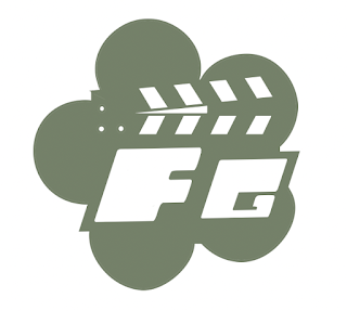
Finale Logo:
Taking into consideration the feedback, I left my logo the same colour and the same layout.
I feel like this logo is very unique and fun, while still maintaining a professional element.
Business card
what is a business card?
"Business cards are cards bearing business information about a company or individual. They are shared during formal introductions as a convenience and a memory aid"
https://en.wikipedia.org/wiki/Business_card
What makes a good business card?
- Clearly display your company name
- Tell people what your company does
- Keep it simple.
- Use of colour
For my business card, I wanted to keep the colour scheme the same as my logo so it would look more cohesive and streamlined.
I began searching for inspiration online
This was my main source of inspiration for my logo, I loved the idea of using the camera setup as a business card and I felt like I could make it very unique.
My Business card
I used photoshop to make the business card as a whole and adobe illustrator to create the star designs for the backs of my business card.
To tie in the aspects of my logo throughout my business card I used the same font and added star details I felt like it all came together really well.
Feedback
From the feedback, the viewers thought that my business card was informative and effective. My camera design paid off as a lot of the feedback was about how they thought the design was cute and unique.
Viewers thought that I could improve on my business card by adding more information about myself. (e.g what services I offer, where I am located).
Reflecting on this, if I was to remake my business card. I would definitely add more aspects about my location and services, however, considering I am uncertain as of now as to what services I will be offering (as I am still a student and don't want to stick to one speciality.)
For a first-time business card, I think that I have done a good job at using my skills to make something that ties perfectly in with my personality and logo.


Comments
Post a Comment